Case study 01Interior · Exterior · Architecture
VMD
Building a timeless identity for a design practice
- Client
- VMD · VMDW.IN
- Sector
- Interior · Exterior · Architecture
- Services
- Brand Identity
- Logo Design
- Visual Language
- Art Direction
- Credit
- HUMANSˣ
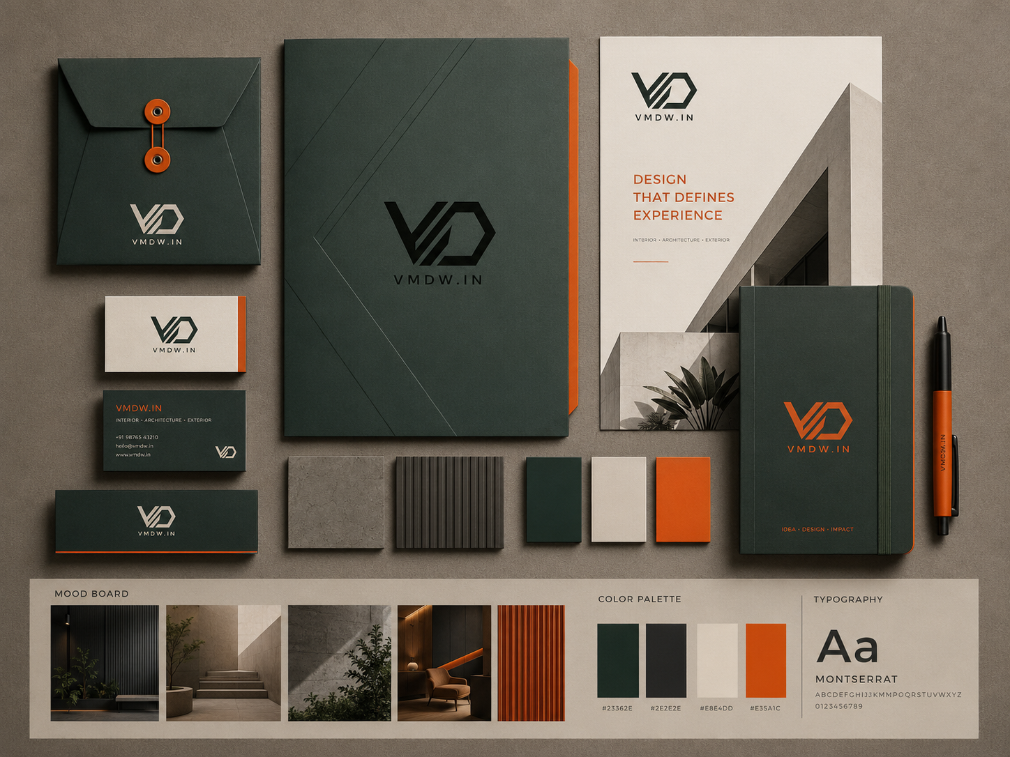
Identity systemStationery, folder, notebook and collateral, with the mood board, colour palette and typography.
Overview
VMD is an interior and exterior design company working across spaces, structures and the environments around them. The brief was simple but demanding: create an identity that felt architectural, progressive and relevant today, without becoming something the brand would need to redesign a few years later.
The goal was not to create another conventional architecture logo built around a roof, building silhouette or floor plan. VMD needed a mark that could become recognisable on its own.
The Challenge
VMD wanted its identity to communicate three fundamental ideas:
Design.Growth.Built Space.
The logo needed to feel strong enough for architectural drawings and site signage, refined enough for premium residential and commercial projects, and simple enough to work across digital platforms, stationery and physical applications.
Most importantly, it needed longevity.
Rather than visually explaining what VMD does, the identity had to capture how VMD thinks.
The Idea
The identity was developed around a single geometric movement.
- The V establishes the foundation of the mark.
- Three parallel architectural lines create rhythm, structure and a sense of elevation.
- The D evolves into a forward-facing geometric arrow, representing progress, direction and the process of moving an idea towards a built reality.
Together, the elements create a compact architectural form that can be interpreted in different ways: a structure, an elevation, a pathway, an arrow or simply the initials of the brand.
This ambiguity was intentional.
The symbol does not illustrate architecture.
It behaves like architecture.
The Logo
The final mark reduces VMD into a bold geometric system.
The angular construction references architectural drafting and built forms, while the repeated diagonal lines create movement through the identity.
The forward-facing D prevents the logo from becoming static. It gives the mark its central philosophy: design should always move forward.
The compact form also allows the logo to function independently as a brand icon without relying on the full company name.
VMDW.IN sits beneath the symbol as the digital signature of the brand, creating a contemporary identity designed equally for physical and digital environments.
Visual Language
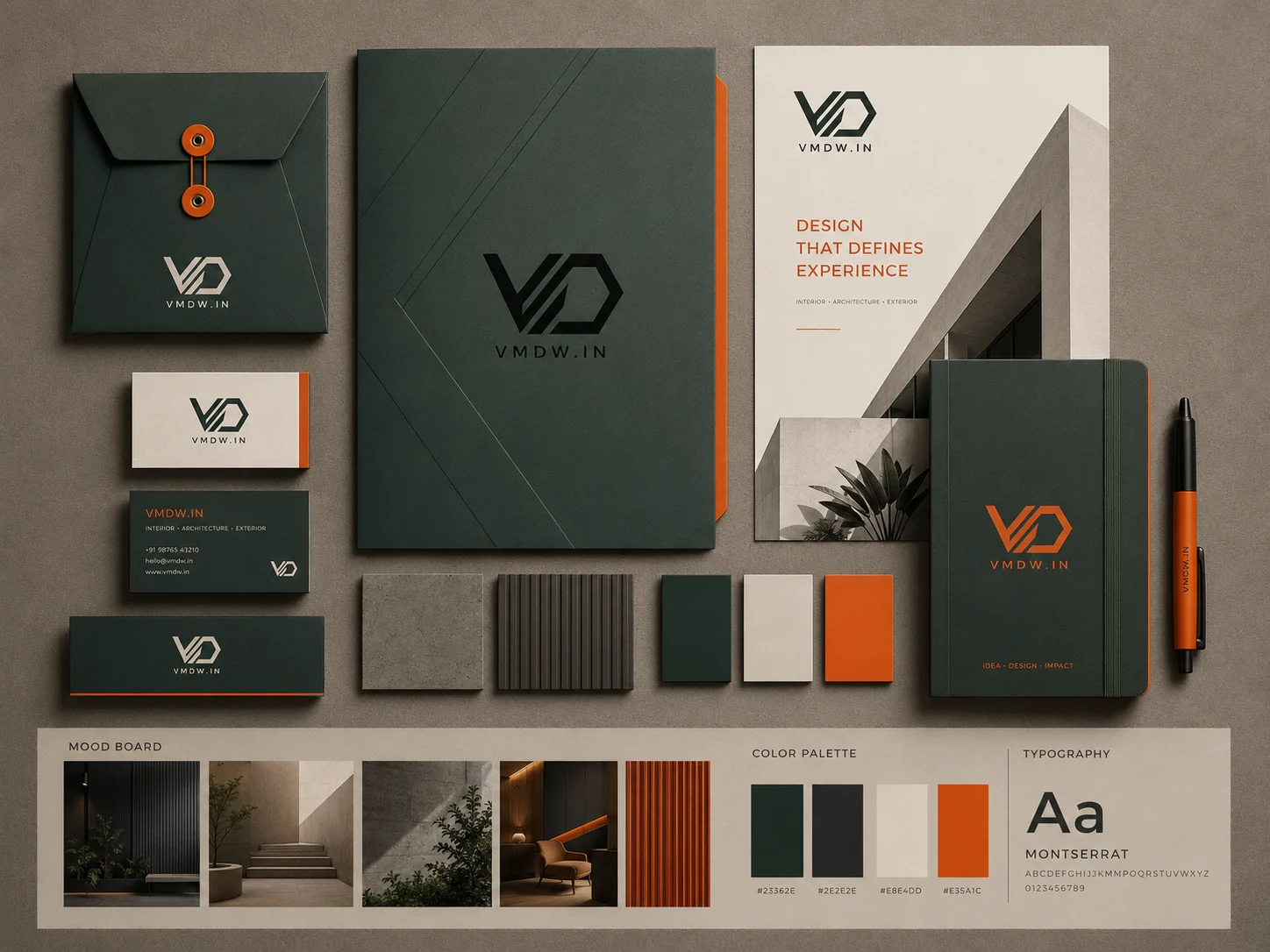
The brand palette takes inspiration from architecture itself: materials, landscapes, surfaces and construction.
Colour values as specified on the palette in the VMD identity board. Select a swatch to copy its value. Typography on the board: Montserrat.
Together, the palette gives VMD a distinctive personality without allowing colour to overpower the architecture.
The identity is designed primarily as a monochromatic system, ensuring the logo remains recognisable regardless of application.
Designing Beyond the Logo
The geometric principles of the symbol extend into the wider visual identity.
- Diagonal lines become framing devices.
- Architectural angles inform layouts.
- Large-scale typography creates structure.
- Orange is used selectively as an accent rather than decoration.
Across stationery, project folders, presentation documents, business cards and digital communication, the same visual grammar repeats without becoming repetitive.
This gives VMD a system rather than simply a logo.
Applications
- 01Stationery
- 02Project folders
- 03Presentation documents
- 04Business cards
- 05Digital communication
The Result
The resulting identity is confident, architectural and deliberately minimal.
It communicates what VMD stands for without relying on obvious symbols of homes or buildings. The identity has enough character to be recognised but enough restraint to evolve with the studio as its work, scale and portfolio grow.
A mark built around structure.A visual system built for growth.An identity designed to move forward.