
Case study 02Café & Experience Studio · Vasant Kunj, New Delhi
KOSHĀ
Branding a Café Around Taste, Space and Product Experience
- Client
- KOSHĀ, Café & Experience Studio
- Location
- Vasant Kunj, New Delhi
- Services
- Brand Identity
- Creative Direction
- Spatial Visual Language
- Menu Design
- Illustration
- Website Design
- Credit
- HUMANSˣ
Overview
KOSHĀ is a café and experience studio in Vasant Kunj, New Delhi, conceived as a space to Meet • Eat • Discover.
The brief began with a visual identity for a new café, but quickly grew into something larger. KOSHĀ was not intended to feel like a conventional neighbourhood café. Food, interiors, events and community experiences were all meant to exist within the same world.
Our role was to create that world.
From the logo and elemental colour system to the café interiors, hand-painted menu graphics and digital experience, we developed a visual language that could move naturally between food, space and communication.
The Challenge
KOSHĀ needed an identity that could communicate two things at once.
It had to feel warm, accessible and appetising as a café, while still carrying the depth and curiosity of an experience-led brand.
The visual identity also needed to work across very different applications:
- Signage
- Menus
- Uniforms
- Interiors
- Digital platforms
- Event communication
- Everyday café collateral
Rather than treating each of these independently, we looked for one central idea that could hold the entire brand together.
The Logo
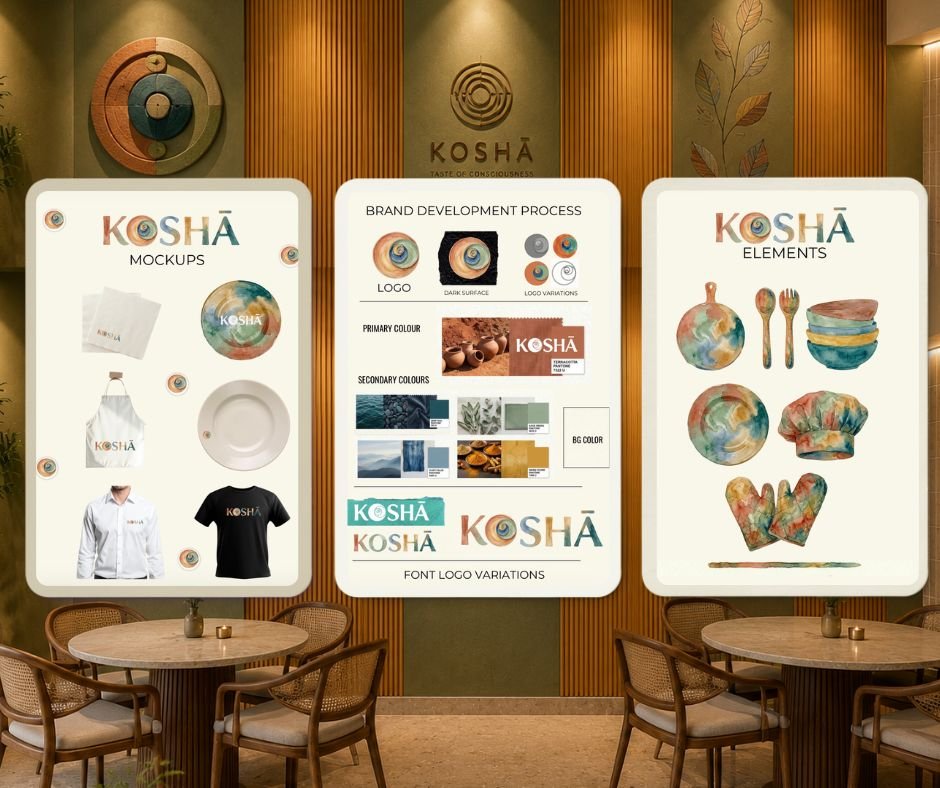
The KOSHĀ mark draws inspiration from something immediately connected to food: a platter and its bowls.
Circular forms of different proportions move inward in a spiral-like composition, inspired by the balance found in natural growth patterns and Fibonacci sequences.
Seen literally, it resembles a thali with vessels arranged around one another.
Seen abstractly, it becomes a symbol of movement, layering and convergence.
The mark was integrated into the O of KOSHĀ, allowing the philosophy to become part of the word itself rather than existing as a separate decorative symbol.
Each part of the identity carries one of the elemental colours, creating a logo that feels warm, sensory and slightly imperfect rather than clinical.

Colour as an Element
Instead of building KOSHĀ around a single signature colour, we created an elemental palette.
- Terracotta
- Turmeric
- Sage
- Blue
- Deep teal
Terracotta, turmeric, sage, blue and deep teal work together across the identity.
The palette was intentionally inspired by colours that already belong around food: ceramics, spices, herbs, water, clay and natural materials.
The result is colourful without feeling loud.
Rather than assigning colour only as decoration, the palette became a system that could move across signage, menus, interiors, graphic communication and digital experiences.
A Hand-Painted Visual Language
Food is sensory, so we deliberately avoided making the brand feel overly digital or mechanically perfect.
Watercolour became an important expressive layer of the identity.
Coffee, cookies, burgers, sandwiches, pasta, pastries, juices, ingredients and ceramic objects were illustrated by hand in the KOSHĀ palette.
The illustrations appear mainly around edges and corners, leaving generous negative space around content.
This became an important rule for the brand:Expression around the edges, clarity at the centre.
The approach allows KOSHĀ to feel handcrafted and playful without overwhelming the food or information.
Bringing the Brand Into the Café
The identity was extended into the physical space rather than being restricted to signage.
Existing architectural elements were studied and developed through the KOSHĀ palette.
Warm handmade tiles, sage surfaces, elemental colours, textured panels, natural finishes and softer visual interventions became part of the spatial direction.
The objective was not to turn the café into a heavily branded environment.
Instead, the brand was allowed to appear through material, colour, texture and small visual moments.
The result is a space where the identity can be felt before it needs to be read.
From Café to Experience Studio
One of the most important aspects of the brand was communicating that KOSHĀ is not simply a place to eat. It is positioned as a Café & Experience Studio.
The phrase MEET • EAT • DISCOVER became the clearest articulation of that idea.
Meet •Eat •Discover
It leaves room for KOSHĀ to host conversations, workshops, tastings, screenings, collaborations, intimate gatherings and other experiences alongside its everyday café offering. The identity therefore needed to remain flexible enough to grow with the programming of the space.
Website Design
The website takes the physical KOSHĀ experience into a quieter digital environment.
Rather than filling the screen with graphics, the design uses generous negative space, the warm ivory brand background and carefully placed illustrations.
The digital experience introduces KOSHĀ through three simple ideas: Meet. Eat. Discover.
Watercolour illustrations appear selectively throughout the interface, while larger spaces remain calm and readable.
The result is a digital identity that feels connected to the café without attempting to replicate the physical space literally.
The website brings together
- KOSHĀ’s story
- Food and beverages
- The Experience Studio
- The physical space
- Events and collaborations
- Location and visitor information
The Brand System
The final KOSHĀ identity was designed as one connected ecosystem rather than a collection of individual deliverables.
- 01Brand Identity
Logo system and elemental identity.
- 02Colour System
A five-colour palette derived from the brand philosophy.
- 03Illustration Language
Hand-painted food, beverage and ingredient artwork.
- 04Menu Design
Food, beverage and wellness menu systems.
- 05Spatial Direction
Colour, surface and branded visual interventions within the café.
- 06Launch Communication
Opening collateral, easel signage and café communication.
- 07Digital Experience
Website design and digital brand language.
Together, these touchpoints allow KOSHĀ to remain recognisable even when the logo itself is not present.
The Result
KOSHĀ evolved from a café identity into a complete visual experience.
The system connects: appetite, warmth, material, colour and human interaction.
It can move from a ceramic bowl to a wall, from a menu illustration to a website screen, while still feeling like the same brand.
For us, that became the essence of the project.
Not simply designing how KOSHĀ looks,but creating a language for how it should feel.